HARRISFORTHEPEOPLE

Kamala

In this brilliant piece about campaign graphics at Bulwark , author Jonathan Last misses one of Good Sign/Bad Sign’s first principles. The Harris logo fails to meet the left/right justified test. A sign/logo does no good if you can’t see it. That’s another way of saying SIZE MATTERS. And in this case the text is unnecessarily smaller than possible.

As a critique based on graphic design alone, this piece also does not consider that the candidate’s tagline, “FORTHEPEOPLE” will likely doom her campaign. As the former Attorney General for California and District Attorney for San Fransisco, Senator Harris has a law and order background that she can not escape. In 2020, this former prosecutor’s record will likely be found untenable by the liberal wing of the Democratic primary voting block and their activists who will play a major role in narrowing a very crowded field.

There is a belief in public life and politics that if you have a problem, issue or potentially damaging history, you “hang a lamp” on it. You might even put out a press release and address it, late on a Friday afternoon. Sadly for Senator Harris, “FORTHEPEOPLE” is a lamp that will never go out.

GSBS Rural Edition: Candidates of the Corn (and other locally grown vegetables).

image

As election day approaches, many of those signs you spent so many hours to put up are literally disappearing, just when you need them most. That name ID you had hoped they would increase is literally and figuratively blending into, and being swallowed up by, the landscape.

If Stephen King wrote an election year sequel to his Children of the Corn series it likely would have involved arrogant pols who placed their signs on unsuspecting farms only to see them disappear with the rise of the corn. Campaign workers who went in search of the lost signs would themselves be lost.

In the final weeks of the campaign, as desperation begins to set in and candidates litter the public spaces with their bandit signs, the corn sprouts up and swallows them both whole. The only evidence is the bagless wire frames dotting the median strip. To the cheers of sadistic viewers and taxpayers, the farmer’s crazy-eyed, overall wearing children feed the pol-enriched corn to their hogs. In an ironic twist, those who once voted for pork, would become pork.

In politics, there is no such thing as bad press…unless it’s your obituary. Don’t be a Candidate of the Corn.

A Sign of the Times

img_3738.jpegThere’s something important coming up but we just weren’t sure what it was. There was a chill in the air and lots of colorful signs dotting the landscape and the median strip. But it wasn’t until we came across this little gem that we realized, there was an election ahead and it is on November 6th!

This got us thinking, “Just how stupid do candidates think we are???” More to the point, are your supporters dumber than your opponent’s? After all, why tip off your opponent’s voters about an election they are too dumb to know is happening?

Or maybe this is just an easy way of clearing a campaign of any voter suppression allegations. “Your Honor, I even included the date of the election on my sign,” one might offer as Exhibit A.

Here’s the thing, signs are not cheap. And you would think someone who purported to be a fiscal watchdog would prove it by reusing his campaign signs. Well good luck, if you’d ever like to reuse this particular sign. You would have to wait until 2046! That will be the next time the state auditor runs for election when the first Tuesday after the first Monday falls on November 6th.

Sadly, even if he managed to keep this very questionable sign around for 28 years, it’s not likely that “Hoss,” a tail-less 60 pound Great Pyrenees/Samoyed rescue originally from La Mancha Animal Rescue, who enjoys chewing on socks and expensive dress shoes (according to his website) will be. By 2046, Hoss would be pushing 200… in dog years.

The Dangers of Sign Pix and Word Bubbles

Photoshopped Signs

State Delegate Christian Miele is running for the State Senate and he is running with scissors. The first term photogenic Republican is challenging his Democratic Senator, Kathy Klausmeier, who is running for reelection to her seventh term in the General Assembly.

In 2014, the district went heavily for Governor Hogan who has strongly endorsed Miele. But you wouldn’t know that by looking at a mailer sent by Senate Democrats on Klausmeier’s behalf. Considering it’s still only September, we have to wonder how far Klausmeier’s one-way love affair might go.

A short drive around the district suggests that Team Miele believes there is no better way to convey ‘New and Improved’ than with pictures. Miele is also trying to prove you can violate literally every rule of campaign signage (and then some) and still get elected. In our Dos and Don’t of campaign signage we strongly oppose including the candidate’s mug, regardless how attractive he/she might be. Miele obviously disagrees, and considering he is currently undefeated in his short career, maybe he’s right.

Out of respect for President Lincoln, we pulled our punches regarding facial hair, but again, it appears to be working for the bearded Miele.

What we failed to include in the “Don’ts” column was any mention of the word or thought bubble. It just seemed redundant. After all, your sign can’t have a word bubble if your sign doesn’t have a face for it to come out of.

Faces on signs are just an invitation for some prankster with a Sharpie to make mischief. But in the Photoshop era, any political hack with a sense of humor or candidate on the ropes might find the word bubble too inviting to ignore.

Including a word bubble isn’t just running with scissors, it’s juggling chainsaws.


Johnny O, Johnny NO! 2.0

IMG_3453
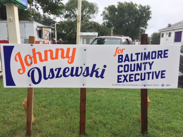
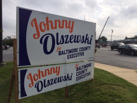
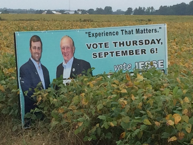
How do you make one of the worst signs in the history of coroplast twice as bad??? Make it twice as big of course.

Because their 2×8 wasn’t bad enough, Olszewski’s campaign decided to double up and top it off, literally and figuratively. As if two unreadable signs were easier to read than one unreadable sign, they stacked a 4×8 on top of a 2×8. And then installed the signs FACING AWAY FROM TRAFFIC so drivers could attempt to read them backwards in their rearview mirrors. Why did no one ever think of this idea before?

Or is this something more sinister?

Never in the history of Good Sign Bad Sign have we seen such a bogarting of the wood. Slate signs are difficult to design and the logistics are often difficult as well. Unless an entire slate survives the primary the winning candidates have to create new slate signs. More often than not they share lumber. Not in this case they don’t.

Ever get on a crowded bus or train only to find passengers with their bags on the remaining seats? Could that be what’s happening here?

GSBS can’t help but wonder who Team O is trying to keep at arm’s length. Why is there is no room at the inn for the top of their ticket? After all, Ben Jealous received 41% of the vote in Baltimore County, in a 9-way race, finishing with over 34,000 votes. Those numbers alone don’t tell the whole story. What is most impressive about the winner’s totals is that he bested the second place finisher, PG County Executive Rushern Baker, by a punishing 20,000 votes.

Who wouldn’t want that kind of star-power on their ticket? Olszewski received 6,300 fewer votes than Jealous, while running on virtually the same extremely liberal platform. They share the same base yet he squeaked out just a 9-vote margin over three opponents. In a county with a 2-1 D/R ratio, you almost have to wonder why Landslide Johnny isn’t nailing up the Jealous signs himself.

Actually the nickname ‘Landslide’ should go to Jealous, who literally could have claimed victory at 8:01 pm on election night while people were still standing in line to vote. Jealous could have walked his family to Disney World and back before Olszewski’s win was certified.

Maybe it’s Jealous who doesn’t want to be seen with Olszewski. Who’s the drag on this ticket anyway??? That makes more sense. Or maybe Jealous read our previous blog post, Johnny O…Johnny NO! and doesn’t want his signs to be paired with the worst signs ever.

Or maybe Jealous doesn’t have any signs… We’ll keep searching.


Rep. Yoho…YoNO! Well, Maybe.

IMG_3442
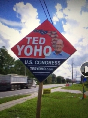
First let’s start by saying, “We love us some Ted Yoho.” And Ted Yoho loves limited government, free markets and federalism. Not only that, but the good congressman from the armpit of Florida (CD3) is one of the stars of The Swamp. So it pains us to rib him about his very bad signs. Yoho violates just about every rule of campaign sign design we cover in Good Sign Bad Sign 101.

Now if you are wondering why we chose to highlight the bad sign of a friend when there are literally thousands of bad signs we could showcase here (many of which have been sent to us by our readers, thank you) it’s because of one brilliant aspect of his design worth sharing … It’s a One-Poler.

GSBS are big fans of the 2×8 rectangle and 4×4 square because of their cost and efficiency compared to the 4×8. But neither are as easy to install as Yoho’s Diamond One-Poler.

Nothing on your campaign is as intoxicating as the smell of your first shipment of big signs. We love the smell of coroplast in the morning because it smells like victory! But that buzz wears off in a hurry when you realize you have to put them up. That’s right, if you are running for state or local office, you will likely be the one to install them. Even great signs are no good to your campaign if left in storage or tacked on the wall in your campaign office.

Because they require only one post instead of two, the Diamond One-Poler is instantly twice as fast to install and saves 50% or more on lumber. Just make sure to have the flutes running horizontally to keep the sign from folding around the post in a heavy wind and you can likely avoid a crossbar.

In this episode of The Swamp, Yoho is interviewed while holding a yard sign and waving at traffic. We will take issue with his form in a future post we’ll call Sign Waving 101. For now, just notice that a three term congressman from a relatively safe district is standing on a corner waving at traffic. If he can do it, why can’t you?


Psychological Campaign Warfare 101


Good Sign Bad Sign: Statewide Edition

IMG_3432
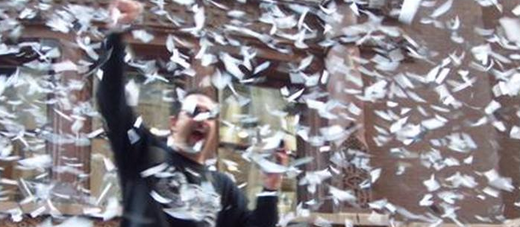
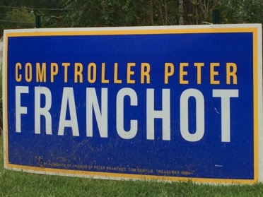
There is a lot to debate about Maryland Comptroller Peter Franchot, but what is not debatable is that the titular head of the MD Democratic Party (debatable)  knows how to design a good sign. OK, maybe he didn’t design it, and since he has more important things to do than micromanage a statewide campaign, we hope he didn’t.

Franchot gets points for having his name left/right justified, for majority name coverage, for proper scale, for sharp color contrast and for bold capped lettering sans-serifs. He also gets points for what he didn’t do, no website, no picture, no cursive. And in a world of black, red, white and yellow signs all promoting the state colors, this sign stands out because you would expect to see it in Delaware. Perhaps unintentional, but still a good call. As summer turns to fall, this sign will not get lost in the landscape.

Slightly modified, it would fit on a 2×8 for half the price and be easily installed with other statewide candidates, but GSBS doubts that will happen. The taxman has carved out a comfortable (debatable) place of independence in this election, and slate signs or any similar pairing will not likely happen under his authority line.

Franchot is practically running unopposed and will get reelected (not debatable) regardless of the quality of his sign. If he has designs on another office in the future, his attention to detail on these little things bodes well for that success.

WINNER! 5/5 Stars.

When Even a Bad Sign is a Good Sign

Rudy Peters Sign

Rudy Peters, the Republican nominee facing Representative Eric Swalwell in California’s 15th district was willing to take a bullet for his party, but apparently not suffer a literal flesh wound at the hands of a deranged knife-wielding attacker. While working his campaign booth during the Castro Valley Fall Festival, police told the Sacramento Bee that Peters, a Navy veteran, used one of his campaign signs to fend off the threat.

Attacks on candidates are likely to increase in the future, one veteran hack told GSBS. “Back in the days before coroplast and bag signs, these sorts of attacks were rare. When you carry a sledgehammer, a wooden stake and a commercial grade stapler, thugs tended to leave you alone.”

Peters will need more than a good campaign sign (which he obviously doesn’t have, See GSBS 101) and a lot of luck (which he obviously does have) if he hopes to unseat Swalwell, who won his last race with 74% of the vote…


Johnny O… Johnny NO!

IMG_3434

Shame on Good Sign Bad Sign 101 for failing to suggest NOT using cursive on a campaign sign, but frankly, it never occurred to us that anyone with an ounce of credibility or a shot at winning would even consider it. Silly us. But here you have it, perhaps the first such sign in the history of campaigns, or at least the history of coroplast. Can’t you hear the ‘artist’ saying to the candidate, “Your name is already difficult enough to pronounce, so why don’t we make it difficult to read too??? And just to make matters worse, we’ll make your name smaller than necessary so we can make room for some odd shape on the left margin that has no relevance. OK?” But for some odd reason BALTIMORE COUNTY EXECUTIVE is bold, capped and sans-serifs.

Olszewski deserves credit for not insulting voters by putting his web address on the sign (this ain’t the 90’s), for not putting his mug on it and for not wasting a 4×8 when a 2×8 would do.

Reader Challenge: If you find a sign (not in braille) more difficult to read than this, send it in.

GSBS is really going out on a limb here because we are located in BALTIMORE COUNTY where the next EXECUTIVE will determine which streets get plowed and which do not…

Epic Fail. 0/5 Stars.